Overview
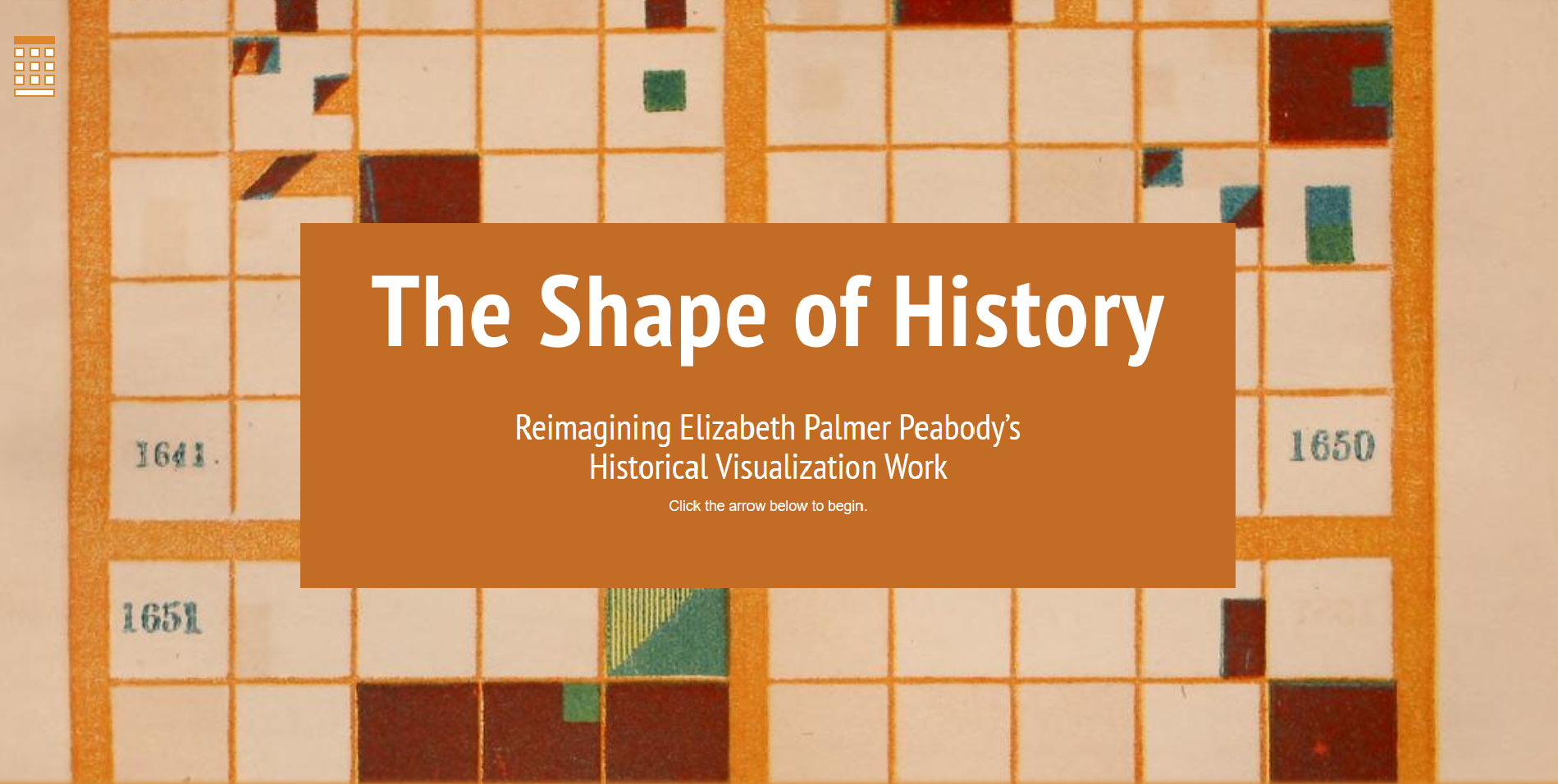
The Shape of History is a site that takes inspiration from Elizabeth Palmer Peabody‘s own historical charts. Peabody was an American educator, most well known for opening the first English-languaged Kindergarten in the United States, that developed a method of translating historical events into shape and color. The Shape of History uses the same method, where they present a century in a 10×10 grid, split into four quadrants, with each unit representing a year. Users of the sight can color code certain events in a century, and highlight years where such an event occurred with their assigned color.
For example, say users wanted to highlight ever major American fire in the 19th century. They can assign different colors to the causes of fire (natural, man-made, accidental, arson, etc.) and then apply those colors to the years they happened. The purpose of this is to provide information in a much quicker, visual way – it is much simpler to understand the impact of something when presented in one simple picture, rather than through description and words.
The Shape of History was conceived by Laura Klein. With the help of Caroline Foster and Erica Pramer, the site’s prototype was designed in Spring 2016. Later in the Fall, Adam Hayward and Shivani Negi were brought on to help finalize the site that is now available for use.
Significance
The site seems to be an effective representation of Peabody’s methods, and does a thorough job of explaining how it works. However, it does not have much else in the way of substance – it is a great digital recreation of a fascinating method of history, but does not have much else in the way of substance. As a digital humanities project it is fascinating and well made, but does not hold much significance otherwise.
